The Role of Prototyping in UI/UX Design: From Wireframes to Interactive Mockups
-
Caploitte
-
17 June 2024
-
04 Min Read
What Is a Prototype?
Why are mockups, prototypes, and wireframes so important?
Comparing Wireframe, Prototype, and Mockup in UI/UX
1. Wireframe
2. Mockup
3. Prototype
Common wireframing, prototyping, and mockup tools
Conclusion
Designers frequently use phrases like wireframes, mockups, and prototypes in the context of creating digital products. There are several approaches to modeling the product concept. Similar to creating a sample of your design, prototyping allows you to test a concept of websites and apps before investing a lot of time and resources in the final product by producing a simplified version and seeing how well it functions. In this manner, you may rapidly and simply test out several concepts and adjust your prototype in response to feedback. In this article, we will define prototyping, discuss its use in UI/UX design, and provide definitions for words connected to prototypes, such as interactive mockups and wireframes.
What Is a Prototype?
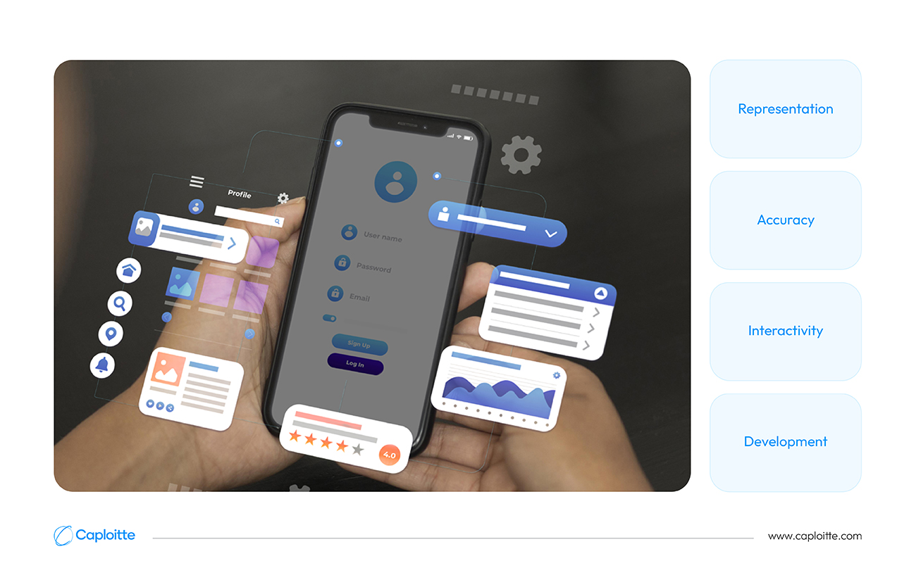
A prototype is a preliminary draft that serves as a reduced version of your software, allowing you to test out various design concepts and gauge user experience. The prototype is simply modifiable, and you can test it with actual users to determine whether they grasp the functionality and find the app or website up to the mark. Designers may prevent surprises later in the development process and make the app’s user experience smoother and more pleasurable for all users by prototyping frequently and early on. In this way, you can identify any unclear or unwanted components early on in the design process.
Four essential characteristics unify all prototypes and set apart various prototyping methodologies from one another:
1. Representation:
The format of the prototype. Examples of this include paper prototypes for mobile apps or HTML, CSS, and JavaScript-coded desktop or Web application prototypes.
2. Accuracy:
This is the degree of detail in the prototype: either high fidelity or low fidelity.
3. Interactivity:
View only, partially functional, or fully functional are the features and functionalities to which users have access throughout the testing period.
4. Development:
This describes the whole history of the prototype; for instance, in fast prototyping, a test prototype is swiftly replaced.
There are different levels of detail you can use when making a prototype, like a draft of your app:
1. Low-fidelity prototypes can be created quickly and easily. They assist you in testing your app’s fundamental structure and gaining an understanding of how users could interact with its various displays. The fact that they lack both interactivity and aesthetic appeal is one of their biggest shortcomings. Low-fidelity prototypes have multiple drawbacks, but they also have many advantages. They are quick, simple, and reasonably priced to envision and produce. Sketches, Click-Through Prototypes, Paper Prototypes, and so forth are examples of this. Click-through prototypes are a little more sophisticated kind of low-fidelity prototype that is used for creating Web pages or mobile app panels. They do this by connecting the various screen designs using hotspots.
2. Medium-fidelity prototypes are a step up. They’re more detailed, but not as polished as a final product. This stage helps you refine your ideas and identify any potential usability issues.
3. High-fidelity prototypes are most like the finished product. They’re very detailed and interactive and feel almost finished. These prototypes can be used to find any places that can be confusing or challenging to use, as well as to test how people will feel using the finished product. Ensuring your software is pleasant to use and user-friendly is the main focus of this stage. Testing intricate user flows can be facilitated by these prototypes. High-fidelity prototypes come in a variety of forms, such as programmed prototypes, digital prototypes made with prototyping software, and interactive prototypes.
Why are mockups, prototypes, and wireframes so important?
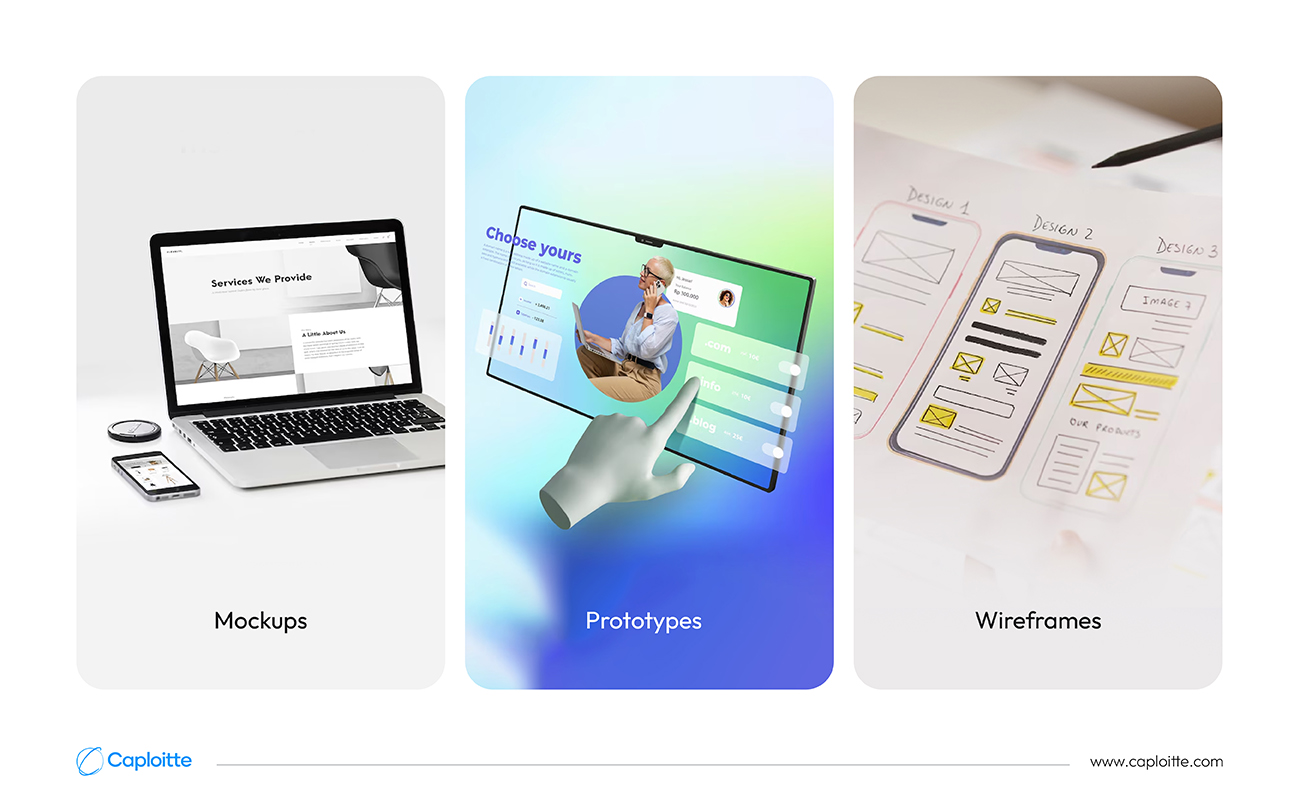
In a product development process, wireframes, prototypes, and mockups are three of the preliminary stages. They provide user testing opportunities for UX (and UI) designers at every step of the design process.
Through user testing, designers can figure out whether their product is suitable for the intended audience, how people interact with it and get value from it, why they use it, and whether it lives up to expectations. User testing will produce a robust, well-rounded solution that benefits users at every stage of the design process, from the earliest, lowest-fidelity wireframe to the highest-fidelity prototype. Despite their apparent similarities, wireframes, mockups, and prototypes each have a different purpose and are used at different stages of the product development lifecycle.
Comparing Wireframe, Prototype, and Mockup in UI/UX
Because of the frequent interchange of these terms, it might be unclear whether and how to employ each one in your product development process. They are essentially diverse and have separate qualities in terms of their design and role in the UX design process, even though their fidelity—the degree of detail and realism in the design—is most often viewed as the primary contrast between them. Selecting the appropriate one at the appropriate time guarantees that the proper amount of work is put in so that you can offer functionality that actually addresses a client’s demand.
Wireframe
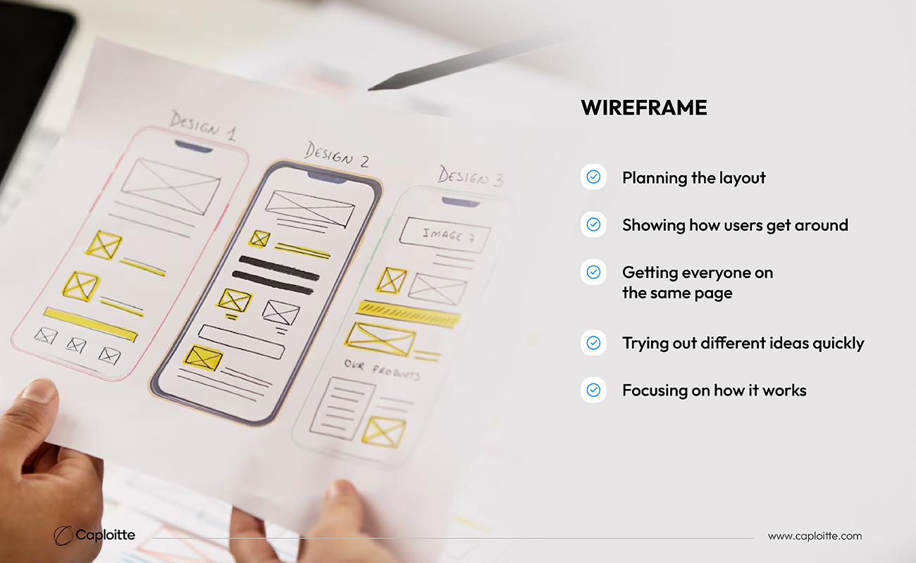
A Wireframe is a simple, low-fidelity depiction of the original product concept that includes all of the necessary components to be found on a website or mobile application. Basic illustrations that highlight the functions of the new feature or product are called wireframes. The information architecture, page structure, layout, and general direction are all clearly outlined in wireframes. A wireframe can be constructed digitally or by hand, and it often only employs the colors black, white, and grey. For the designer, conducting user testing at the wireframing stage is very helpful since it allows them to get frank input that shapes the product concept. Without the visual distractions of color and font, wireframes allow for dependable and transparent user input. It is deliberate to leave out visual components like colors and logos since the main focus of criticisms should be on how well the suggested arrangement or layout will benefit users, not on aesthetics.
Wireframes are like a basic sketch of your app or website before you get to the colors and details. In essence, they help with a few things:
1. Planning the layout:
It is like sketching out where the buttons, menus, and content will go, like a blueprint for your website.
2. Showing how users get around:
Wireframes help plan how users will move between different screens or pages in your app.
3. Getting everyone on the same page:
They’re a great way for designers, programmers, and other people working on the project to all be on the same page about the basic idea before anyone starts building anything complicated.
4. Trying out different ideas quickly:
Trying out different ideas quickly: Because they’re simple, you can make changes to the wireframe easily to see what works best.
5. Focusing on how it works:
They just focus on making sure everything works well together.
Mockup
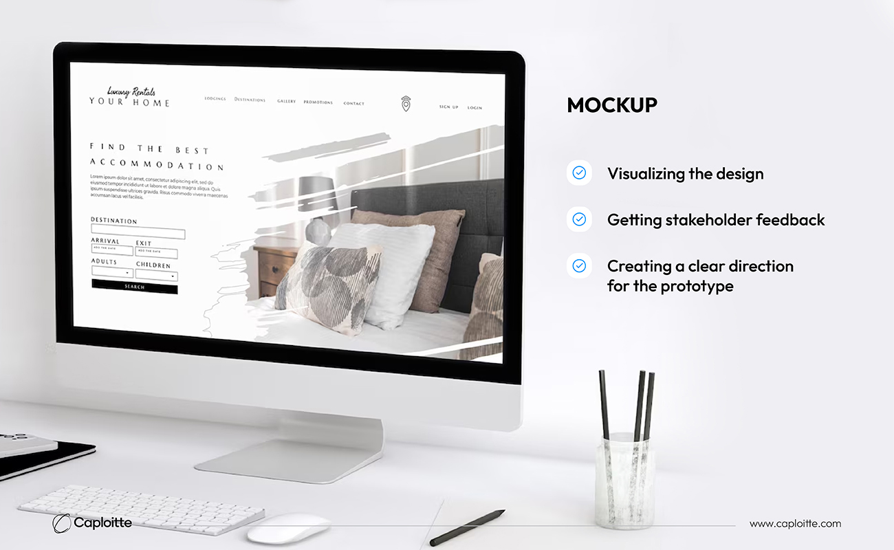
A high-fidelity, static imitation of the final product that conveys the visual style, color scheme, typography, and iconography of the product design is called a Mockup. Mockups take wireframes to the next level by incorporating design components. Typically, many mockups are created to provide decision-makers with a variety of possibilities to consider. The team can get a consensus on a design direction by comparing mockups. In the wireframing and prototype stages of the product design process, many of the questions that occurred should have been addressed by the designers in the mockup stage. That’s not to argue that mockups don’t yield insightful user input. It is easy to evaluate what about the designs makes sense from the user’s point of view because of the realistic depictions. Mockups’ static nature makes it simple to incorporate any requests or modifications.
They focus on how the final product will look, not how it will work. In essence here’s how mockups help with prototyping:
1. Visualizing the design:
Mockups give a realistic idea of the final product’s appearance, including colors, fonts, buttons, and images. This helps designers refine the visual style before moving on to interactive features.
2. Getting stakeholder feedback:
Mockups are easier for non-designers to understand than technical prototypes. This allows stakeholders to provide feedback on the overall look and feel before development starts, saving time and money down the line.
3. Creating a clear direction for the prototype:
Mockups act as a blueprint for the interactive prototype. They show where buttons and menus will go, making it easier to create a prototype that reflects the final design.
Prototype
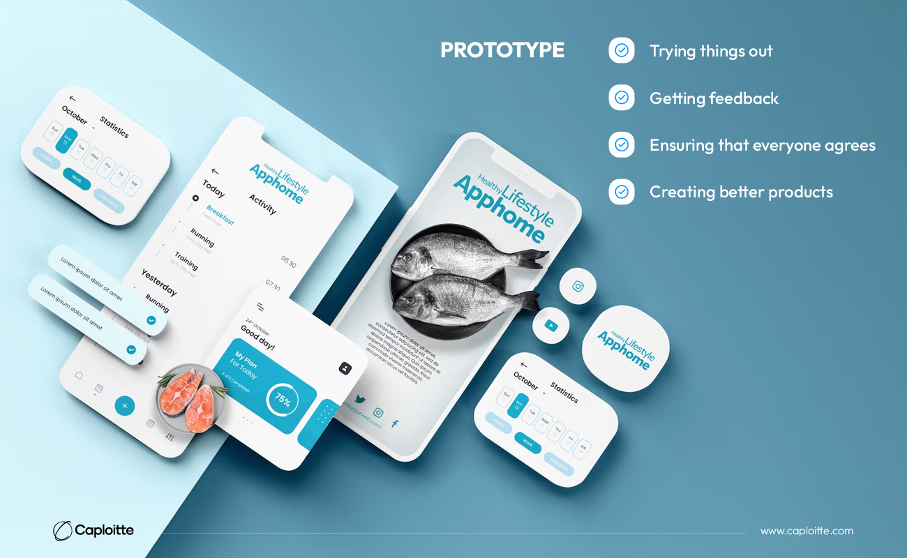
As we have discussed above, a functioning model of an application or website is called a Prototype, and it is the final stage in the product design process following wireframing. Through prototyping, designers can assess the user experience, consider how the user could switch between activities or actions to accomplish certain goals and identify any possible problems with the flow of the interaction. High-fidelity models of a new product or feature that show how a user will interact with it are called prototypes.
Before spending a significant amount of time and money on the final product, you can evaluate how it will function and feel with prototypes. In essence, this is how designers benefit from prototypes:
1. Trying things out:
Prototypes are interactive, so people can click around and see how the final product might work. This helps designers identify any problems early on before they become bigger issues.
2. Getting feedback:
People can use the prototype and tell designers what they think. The designers utilize this feedback to refine the design and ensure that it is user-friendly and pleasurable.
3. Ensuring that everyone agrees:
Everyone working on the project, from managers to designers, can better grasp the ultimate product’s appearance and feel with the use of prototypes.
4. Creating better products:
Prototypes enable designers to make early modifications and gather feedback, resulting in finished items that users will adore.
In order for teams to create a product that consumers would like, wireframes, mockups, and prototypes help to clarify what customers actually need. In order to create and distribute visual product roadmaps and centralize product strategy, many product teams opt for dedicated product management software.
Common wireframing, prototyping, and mockup tools
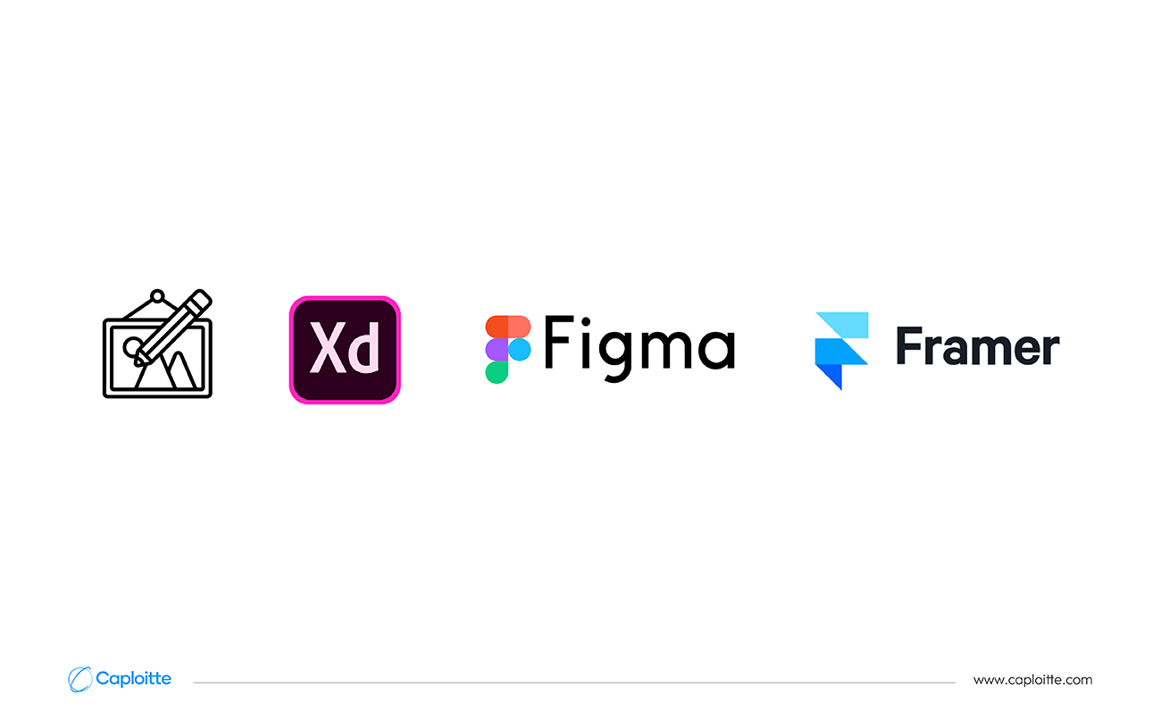
After defining these terms, let’s examine the tools used by designers to produce wireframes, prototypes, and mockups.
1. Drawing:
Sometimes nothing generates ideas faster than a pencil and paper. Gather your team and begin sketching up possible website layouts, buttons, and boxes. Mostly used for visual/UI design, Sketch is also widely used to create wireframes and mockups. There are several advantages to stepping away from internet distractions, and brainstorming as a group may reveal flaws in ideas that an individual may have overlooked.
2. Adobe XD:
Adobe XD is particularly noteworthy. It is found that XD is a little more user-friendly than the other tools. Additionally, Adobe provides a wealth of top-notch developer education materials, such as a substantial library of articles, videos, and excellent documentation.
3. Figma:
Figma is an effective application that helps designers produce realistic and interactive mockups of their concepts, which speeds up the prototype process.
The ability to modify the code allows the designer to update the functionality of the website much more quickly and gives developers access to code that they may use to further enhance the page or product feature.
Conclusion
Making a website that is easy to use is not as simple as it may appear. To create the best prototype for your company, there is no set procedure that you have to adhere to. It must, however, work with the requirements of the business and your app design. By now you must get an idea of how wireframes, prototypes, and mockups differ from one another. Since many of these three processes’ qualities really enhance one another, it’s best practice to use all three in the design process rather than picking a preferred one.
Share this post:
Read More
- All
- AI
- AR
- DevOps and CI/CD
- E-commerce
- FinTech
- IoT
- Mobile Development
- Outstaffing
- Security
- SEO
- Tech Trends
- Web Design
- Web Development


